
Tips for Designing Effective Business Cards - Business Card Designs Doha Qatar
Designing an effective business card involves more than just displaying your contact information. It’s about creating a memorable impression and conveying your brand’s identity. Here are some tips to help you design business cards that stand out and make a lasting impact:
1.Keep it Simple and Clean
Avoid Clutter: Focus on essential information only. Too much text can make the card look crowded and hard to read.
White Space: Use white space strategically to create a balanced and clean design.
2. Use High-Quality Materials
Paper Quality: Choose a sturdy cardstock with a nice texture. Heavier paper stocks (300 GSM or more) feel more premium.
Finish Options: Consider finishes like matte, glossy, or satin to enhance the look and feel. Special finishes like embossing, foil stamping, or UV coating can add a unique touch.
3. Incorporate Your Branding
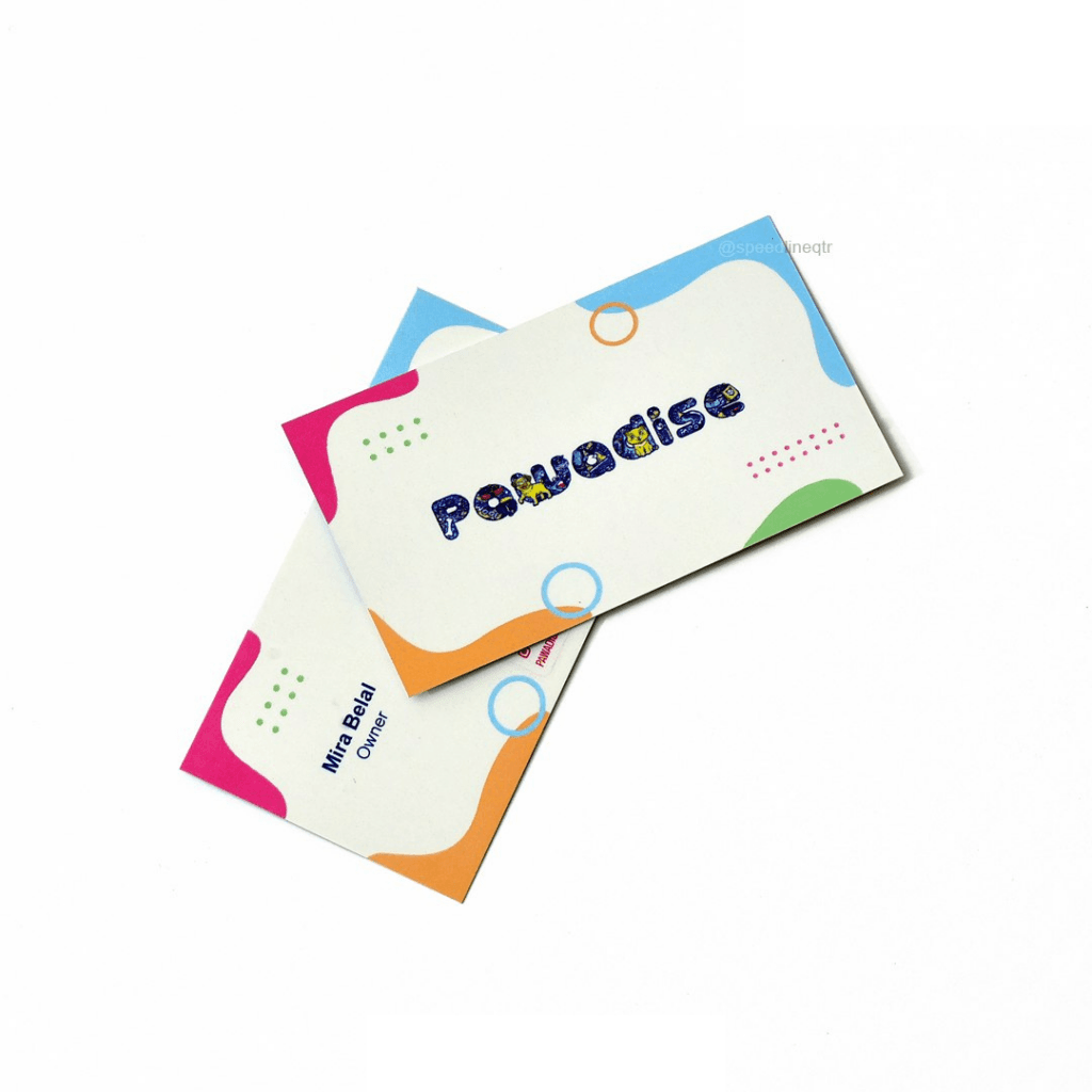
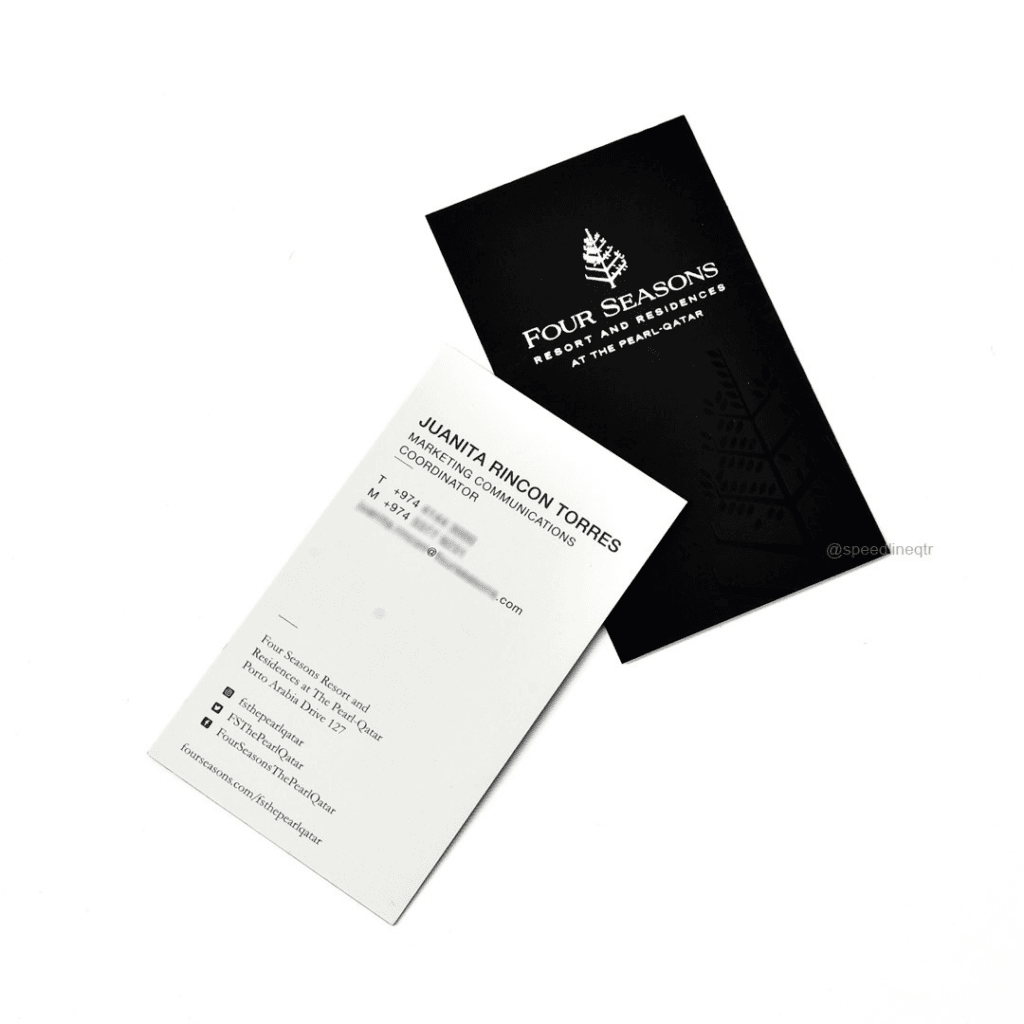
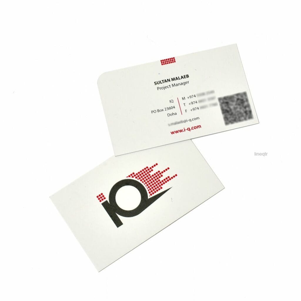
Logo and Colors: Use your company’s logo and brand colors to create consistency with your other marketing materials.
Typography: Select fonts that reflect your brand’s personality. Ensure they are legible and professional.

4. Include Essential Information
Contact Details: Ensure your name, job title, company name, phone number, email address, and website are included.
Social Media: Add relevant social media handles if they are important for your business
5. Utilize Both Sides
Front and Back: Use both sides of the card to maximize space. One side can be dedicated to your logo and tagline, while the other side contains your contact information.
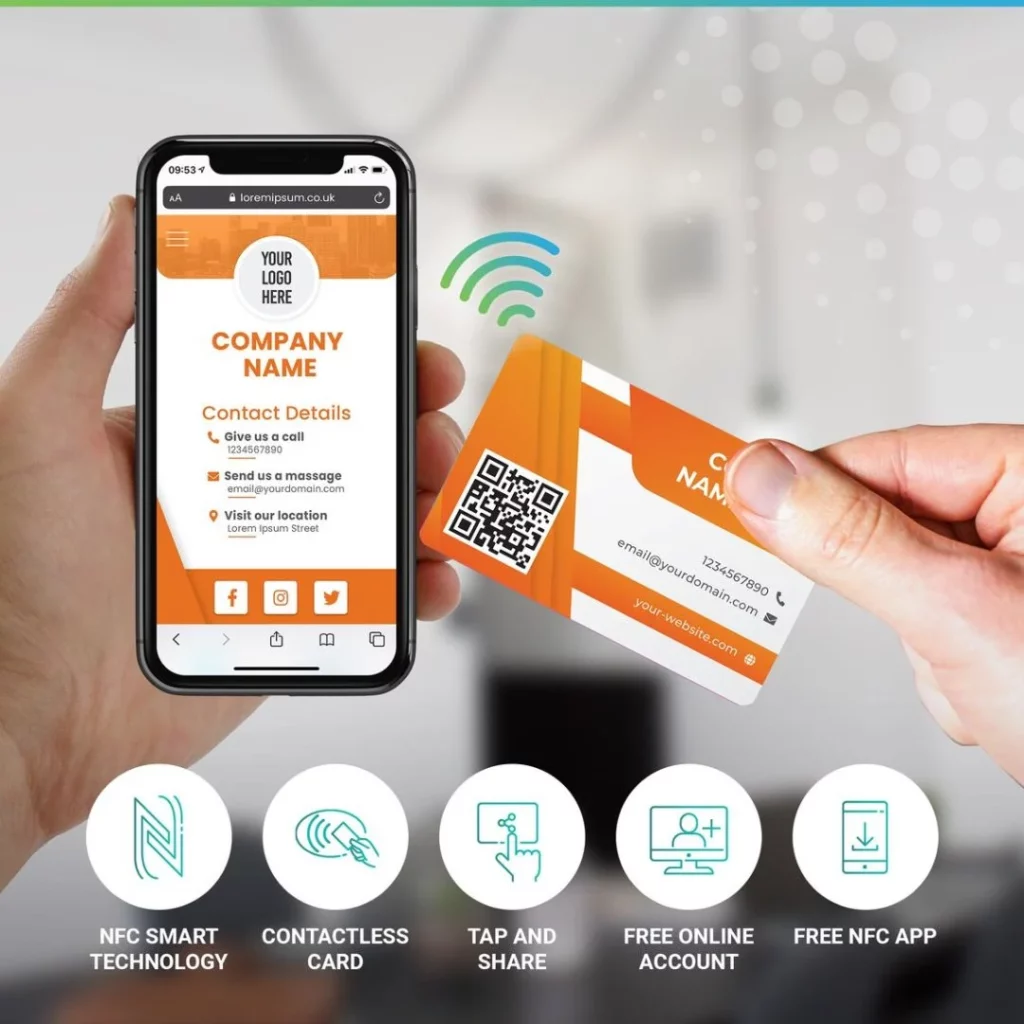
Call to Action: Consider including a call to action or a QR code that leads to your website or a special offer.
6. Add a Unique Touch
Shape and Size: Experiment with non-traditional shapes and sizes to make your card stand out, but ensure it’s still practical to carry.
Interactive Elements: Include features like QR codes, augmented reality elements, or NFC chips for a modern touch.
7. Ensure Readability
Font Size: Use a font size that is easy to read. Avoid fonts that are too small or overly decorative.
Contrast: Ensure there is enough contrast between the text and the background for readability.
8. Visual Hierarchy
Prioritize Information: Use different font sizes and weights to highlight the most important information.
Alignment: Ensure text and elements are aligned properly to create a cohesive and professional look.
9. Use High-Resolution Images
Logo Quality: Ensure your logo and any images are high resolution (at least 300 DPI) to avoid pixelation when printed.
Image Formats: Use vector graphics for logos and icons to maintain quality at any size.
9. Use High-Resolution Images
Logo Quality: Ensure your logo and any images are high resolution (at least 300 DPI) to avoid pixelation when printed.
Image Formats: Use vector graphics for logos and icons to maintain quality at any size.
10. Proofread Carefully
Check for Errors: Double-check all information for accuracy and correctness.
Get a Second Opinion: Have someone else review your card for any mistakes or areas for improvement.